HOME
TECHNOLOGY +
DIGITAL MARKETING
BUSINESS +
SERVICES
EDUCATION
OTHER +
All Categories
SUBMIT BLOG
Recent Posts
business
898
Why LED Panels Are the Better Choice for Offices?
November 28, 2025
by
akashmodh
business
5022
PM Mudra Yojana: Financial Fuel Igniting India’s MSME & Startup Boom
June 25, 2025
by
akashmodh
business
4995
Printed patterns in 10×10 Custom Greaseproof Paper sheets
April 17, 2025
by
emmy1122
technology
5833
Top API Service Provider in India - Elevate Your Business
March 19, 2025
by
ecuzensoftware
technology
5544
Top 5 Best Android App Development Companies in Dubai
March 19, 2025
by
solveittechnolo
Subscribe to the best creative feed.
Categories
Business
Technology
Health & Fitness
Services
Home Improvement
Education
Web Development
Tour and Tavels
Lifestyle and Fashion
Digital Marketing
Mobile App Development
Others
E-commerce site
Manufacturing
Real Estate
Company
Food
Entertainment
Transport Services
Shop
Home Appliances
Beauty Products
Online Shopping
Android
Courses
SEO Services
Small Business
News
Game
Content Marketing
Colloge
Search Engine Optimization
Sports
School
Latest
Electronic Gadgets
University
Mobile Game Development
Security
Apple
Graphic Design
Software Testing
Legal Services
Ecommerce Services
Innovations
Enterprise Software
Gift Articles
Programming Language
Entertainment
Top stories
Trending Post
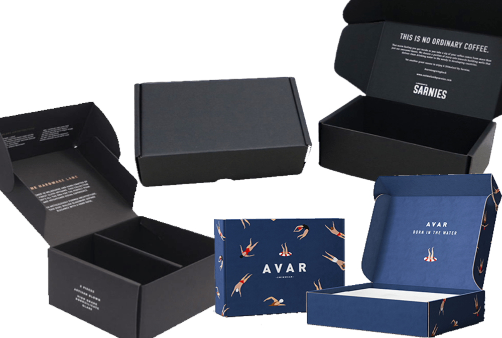
Tips on Finding a Skilled Custom Corrugated Mailer Boxes Manufacturer
September 14, 2020
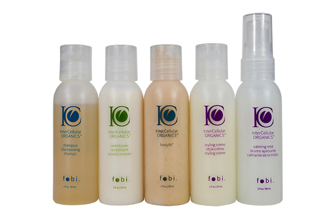
5 Puerto Rican Curly Hair Products You Need
September 11, 2020
Have You Gone Through All the Universities of Different Countries?
September 24, 2020
1337x Proxy server and Those Sites through connection
September 25, 2020
Point Slop Formula
April 23, 2021
Privacy Policy
Write for Us
© Copyright 2026 by
MyBlogTime
Powered By
Shiv Technolabs Pvt Ltd.


.webp)


